Understanding how to balance text and images in a pitch deck is critical because everything can matter when it comes to your pitch deck.
You can have your data right, incredible text copy, superb financial models, good flow, and a much-needed solution to a big problem, but balancing visuals and written content can still be pivotal to getting investors to jump in and fund you.
The Role Of Visual Design In Pitch Decks

*FREE DOWNLOAD*
The Ultimate Guide To Pitch Decks
While investors may want you to get the facts right and have a cohesive deck presented simply in the right order, the visuals play a big role in winning them over too.
A simple plain white deck of slides with succinct text in a large font that sums things up crisply may check most of the boxes, and certainly beats over cluttering your presentation, you don’t want to miss out on the influence great visuals can have too.
Used well, visuals can be the tipping point that turns a sensible deck into one that gets investors excited about throwing in their money.
Visuals can accomplish a lot psychologically, including generating emotion, positioning, and getting your most important points across more clearly, packing in a lot more perceived value when you’re projecting the business model.
Keep in mind that in fundraising storytelling is everything. In this regard for a winning pitch deck to help you here, take a look at the template created by Silicon Valley legend, Peter Thiel (see it here) that I recently covered. Thiel was the first angel investor in Facebook with a $500K check that turned into more than $1 billion in cash.
Remember to unlock the pitch deck template that is being used by founders around the world to raise millions below.
Here is the content that we will cover in this post. Let’s get started.
Watch Out For The Gotchas
It is worth investing in clean professional graphic design for your pitch deck, though overdoing it can have serious consequences too. Here are just some of them.
Files Sizes
Too much in the way of graphics and images can make your file size massive. Too large to be shared or opened on many devices or through many apps. The last thing you want to do is to cause your message to fail to go through, get read or shared. It’s hard enough already. The same goes for making it too slow to load. Remember this factor when figuring out how to balance text and images in a pitch deck.
Poor Quality Images
Be sure to test images on all screen sizes. Make sure they are crisp, clear, correctly aligned with text and in focus. If you can’t get this right here, how can investors believe you will with your other marketing to customers and for future fundraising rounds or exits.

Raise Capital Smarter, Not Harder
- AI Investor Matching: Get instantly connected with the right investors
- Pitch & Financial Model Tools: Sharpen your story with battle-tested frameworks
- Proven Results: Founders are closing 3× faster using StartupFundraising.com
This is one of the areas that is an exception to the rule of shipping before it is perfect. If it’s not right, leave it out.
Clutter
One of the main purposes of visuals is to highlight and better convey your key points. Overdoing the visuals can have the opposite effect and take away from that. Be careful.
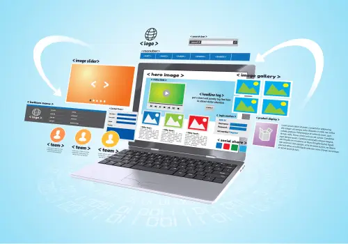
Types Of Images To Use In Your Startup’s Pitch Deck
What types of images belong in your startup’s pitch deck?
Logo
A strong logo starts your deck well, right from the cover slide. Your logo can say a lot about you, including whether you’re really on track with nailing product-market fit and resonating with your ideal customers.
Big Data Point Call Outs
Instead of having text and images compete and clash, or having visuals overshadow the important text, use visuals as callouts to highlight key metrics and maximize them. Market size is one of the most obvious places to use this strategy.
Graphs & Diagrams
Graphs, charts, and diagrams are ideal for efficiently conveying a lot of information in a clean and simple way. The right chart can sum up hundreds of words in a fraction of a second. Understand this when learning how to balance text and images in a pitch deck.
Key places to use various types of charts include:
- SWOT analysis
- Competitor analysis
- Competitive advantage
- Traction and growth
- Market size and segmentation: total market vs. target market and TAM
- Business model
- Financial models and projections
You might also need the proper graphics to show how you’ll avoid cash flow problems.
If you need more information on how to create a pitch deck while balancing the text and images, check out this video I have put together.
Original Photos
Using original photography is definitely better than inserting stock images that may be seen in hundreds of other competing decks. Remember, you want to stand out as being unique and better.
Use high-quality original photos for capturing and displaying:
- Your team in headshots for your team slide
- Your product or prototype in use in real-world situations
- The emotion of the need and problem with pictures of your customers
Be wary of over-editing real photos. Investors will want to know if you are just showing computer-generated prototypes, versus the physical product which has already been built. Don’t make it look too fake if it does really already exist.
Backgrounds & Borders
It’s okay to have a nice clean border or background that is set as the theme throughout your deck of slides. It can make it look far more stylish, credible, and professional if done right.
Keep it simple. Don’t make it too busy to where it distracts from the main points and flow.
Be sure that it transfers well between tools like Google Slides and Powerpoint. The same goes for font styles and dynamic slide transitions.
Give thought to your branding and positioning when choosing backgrounds. Make sure your visuals align with your branding and maximize it, and your value. For example, red just seems to work for successful food industry businesses. Think Burger King, McDonalds, and Chick Fil A.
Blue may remind viewers of successful companies like Facebook or Google, and could add a lot of value for tech startups. If your brand is about sustainability, the environment, or impact, then green might be the right color to use.
If in doubt, stick to more neutral colors that aren’t too extreme. You don’t want to blow it all just because you picked a horrendous border color for your pitch deck.
You may also want to avoid fonts and colors that could be associated with any recent startup disasters that cost investors a lot of money too.
Keep these basic rules in mind when determining how to balance text and images in a pitch deck.
You may find interesting as well our free library of business templates. There you will find every single template you will need when building and scaling your business completely for free. See it here.


Facebook Comments